We recently conducted research with federal partners to better understand the challenges agencies face in dealing with emergency response situations like COVID-19, and how the design system can better support them in the future.
“We keep telling agencies to do all this stuff and fix your websites. But there’s never any money for it. Particularly in the digital age of COVID-19, how can anything be more important than the presence of your website?”
— From a thought-leader during interviews
We interviewed 60 individuals who spanned agency roles and responsibilities to learn about their needs related to using the U.S. Web Design System (USWDS). We also conducted in-depth desk research of other design systems and solicited feedback from the broader USWDS community as we developed new components.
Our primary research goals were to:
-
Understand diverse agency needs relating to emergency response, including specific needs of different roles within the agency
-
Identify opportunities to enable agencies to more quickly post and display information online during an emergency
-
Develop new USWDS components to support agency emergency response efforts
Taking action on what we learned from the research, we created and updated several design system components and templates to address the common needs agencies faced. These updates are included in Release 2.10.0 and you can learn more about them in our December 2020 monthly call (available on YouTube).
Research themes and insights
We took quotes and highlights from the interviews to create data points. Using an affinity map to group similar data points together, we assigned an overarching theme to each group and identified high-level insights that focused the challenges into more actionable solutions.
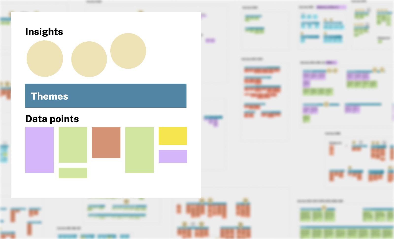
Synthesis process: We captured data and first-hand accounts from interviews, then grouped these by theme to uncover insights and opportunities.
We discovered five common agency needs about how the design system can better support emergency response within federal agencies. Using these insights as a starting point for solutions, we ideated and identified new components and templates to add to the design system, as well as ways to improve some existing components.
1 - Focus on the user perspective
The public needs to be able to easily understand and act on information published on agency websites, especially during an emergency. Many agencies struggle to put the focus on the right information for customer needs when they have a lot of important and valuable information to get across.
Supporting themes:
-
Providing accurate and consistent information helps build trust
-
Need to think about user actions — not just agency reporting
Components created:
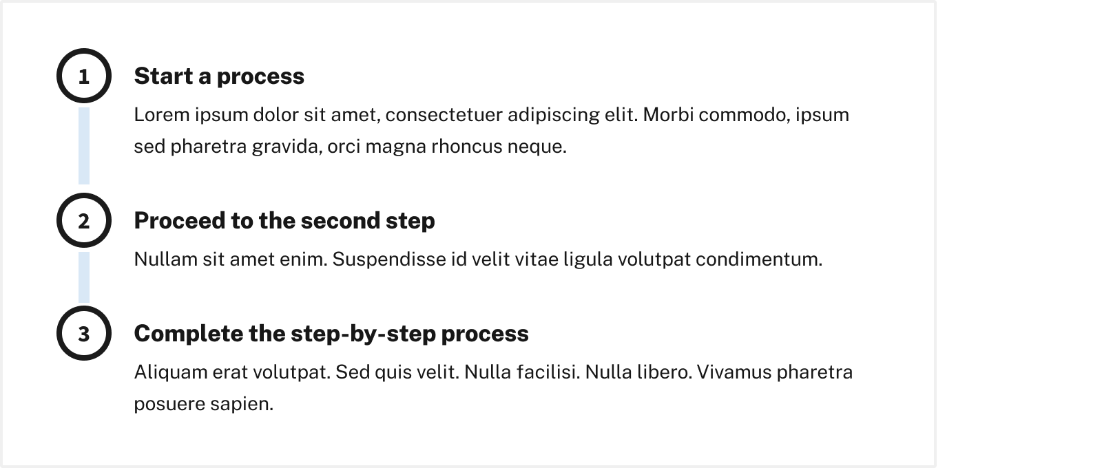
Process list component (new): A process list displays the steps or stages of important instructions or processes.
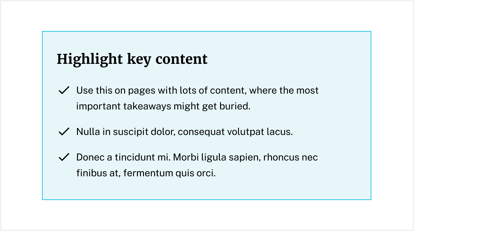
Summary box component (new): A summary box highlights key information from a longer page or displays next steps.
2 - Prioritize information
Communications can get chaotic when making frequent updates or coordinating several emergencies at once. Though many agencies use alert banners, they’re often inconsistent or try to convey too much information at once.
“People can get alert banner happy during a response. At one point we had two banners with three or four links. This is important and new and urgent, but it can be a lot.”
— From a manager during interviews
Supporting themes:
-
Being mindful of when/how to add alert banners to make them more impactful
-
Prioritizing information requires a lot of collaboration and coordination between agencies
Components created:
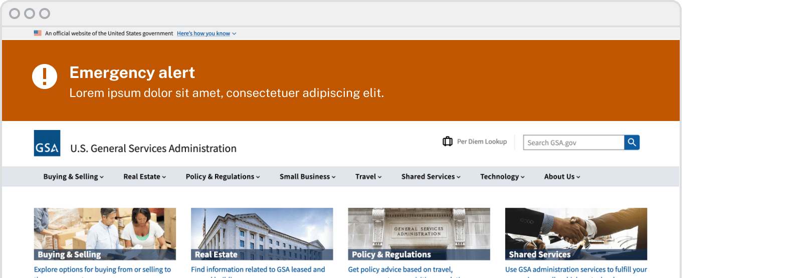
Site alert component (new): A site alert communicates urgent sitewide information.
![]()
Improved icon support (updated): Additional icons and guidance improve how teams use visual cues to make it easier to find information more quickly.
3 - Share common content
Agency websites must gather information from multiple channels, and it can be challenging to determine how to incorporate and organize related news, press releases, and articles without it getting lost or becoming overwhelming.
“How can we present news in a way that is not clunky? We’ve tried to slim it down but it’s become a challenge. We have all these different partners and need a UI to support that—where the news is coming from, what type of news is it? That was a design challenge for us and is still a gap we have.”
— From a manager during interviews
Supporting themes:
-
Using different communication channels for different types of content
-
A need to standardize other channels such as email, social, or fact sheets
Component created:
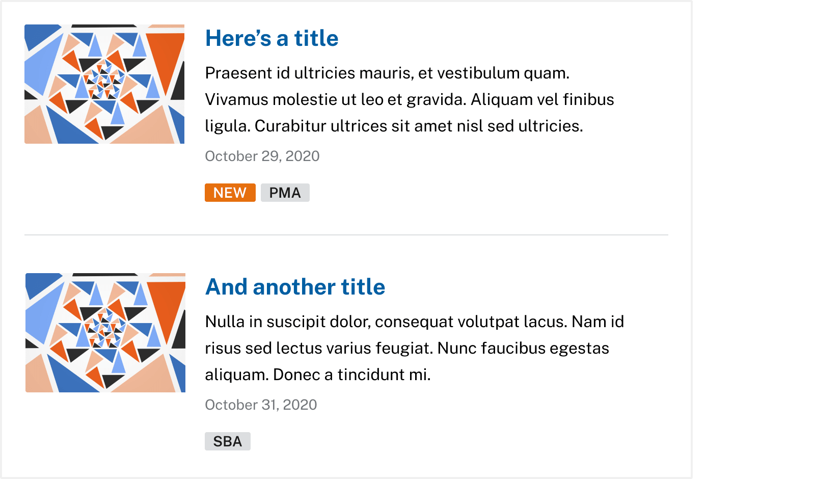
Collection component (new): A collection displays a compact list of multiple related items like articles or events.
4 - Standardize common features
Standardizing common features that are used in an emergency helps to lessen the burden of implementation and reduces friction by establishing consistency across agencies.
Supporting theme:
- Templatizing makes components easier to use and faster to implement
Component created:
Authentication page templates (new): These templates allow users to create a new account, sign in, and choose from multiple authentication providers
5 - Optimize mobile experiences
Mobile devices often become a primary source of connection in an emergency. Agencies need a better way of meeting customer needs by helping them more easily complete actions and digest complex information quickly from a smaller screen
“One big surprise we found during the COVID response was that even providers and first responders are using our website more on mobile than on desktop.”
— From a designer during interviews
Supporting theme:
- Need to think more holistically about digital experience
Components created:

Radio/checkbox tile component (updated): Tiles make it easier to complete mobile forms by providing a larger selection area for radio buttons and checkboxes.
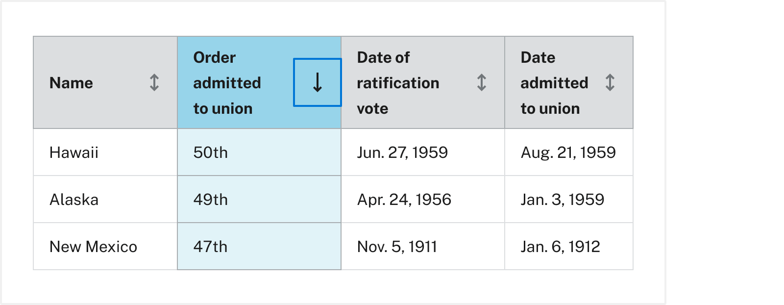
Table (updated): Table enhancements improve the mobile performance of our tables and includes more formatting options and additional accessibility guidance for data tables.
How we created components
After a few weeks of research and user interviews, we used themes and insights from those interviews to generate and gather over 60 component and pattern ideas. We then conducted a prioritization workshop where design, engineering, product, and stakeholders worked collaboratively to understand the effort and value of each idea. Honing in on easy wins and strategic initiatives, we prioritized the components in the GitHub sprint backlog and started creating them.
Additionally, we outlined a component creation process to ensure each component was thoroughly researched, iterated on, and emerged from a highly collaborative process, including getting feedback from customers and other stakeholders.
For every component, we conducted a landscape analysis, created low- and high-fidelity designs, built prototypes, drafted and refined guidance, conducted accessibility reviews, and solicited feedback from the USWDS community and Digital.gov’s user experience community.
What’s next?
The data, themes, and insights will support our decision-making well into the future. The research and interviews created a wealth of information to improve how we support agencies in emergency situations, as well as ideas for the future of the design system and how it can continue to improve.
