Components
Collection
A collection displays a compact list of multiple related items like articles or events. The list links each item to its original source.
About the collection component
The collection component offers users a way to view short descriptions of related content, providing a simple way to access the original source to learn more. It’s useful when you want to highlight information like articles, events, or documents that appear elsewhere on your website or from other sources.
Each item in the collection includes a headline that links to another page and (optionally) a small image, descriptive text, and metadata such as date, time, byline, and tags.
Items in a collection should be related. This could be by publication date (for instance, all the content was posted in the last week), by content type (all articles, events, or blog posts), or by subject (all items relate to the same topic or theme). Be selective about what content you show in each collection. Consider limiting the number of items in each collection to six or fewer.
Default
-
Gears of Government President’s Award winners
Today, the Administration announces the winners of the Gears of Government President’s Award. This program recognizes the contributions of individuals and teams across the federal workforce who make a profound difference in the lives of the American people.
-
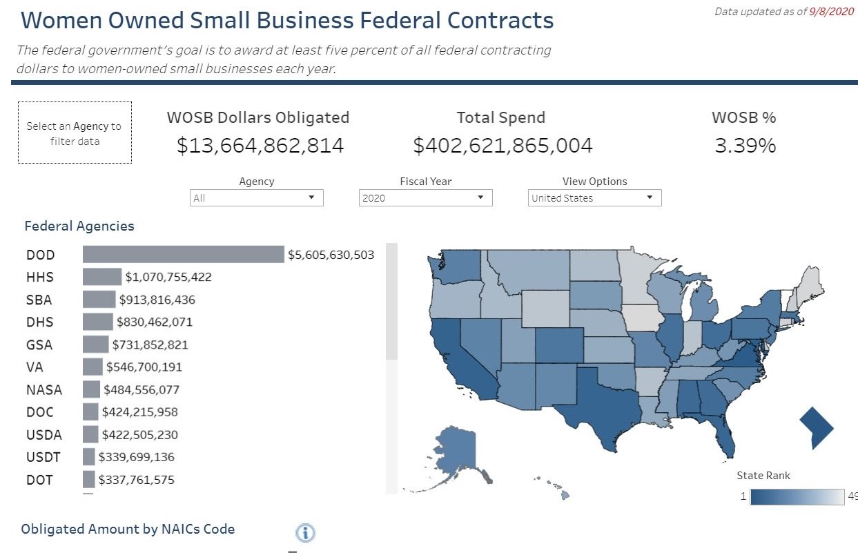
Women-owned small business dashboard
In honor of National Women’s Small Business Month, we’ve partnered with SBA’s Office of Government Contracting and Business Development and Office of Program Performance, Analysis, and Evaluation to highlight the Women-Owned Small Businesses (WOSBs) data dashboard!
-
September 2020 updates show progress on cross-agency and agency priority goals
Today, we published progress updates for both Cross-Agency Priority (CAP) Goals and Agency Priority Goals (APGs) for the third quarter of FY2020. These updates highlight recent milestones and accomplishments as well as related initiatives that support progress towards a more modern and effective government.
Media thumbnail
-

Gears of Government President’s Award winners
Today, the Administration announces the winners of the Gears of Government President’s Award. This program recognizes the contributions of individuals and teams across the federal workforce who make a profound difference in the lives of the American people.
-

Women-owned small business dashboard
In honor of National Women’s Small Business Month, we’ve partnered with SBA’s Office of Government Contracting and Business Development and Office of Program Performance, Analysis, and Evaluation to highlight the Women-Owned Small Businesses (WOSBs) data dashboard!
-

September 2020 updates show progress on cross-agency and agency priority goals
Today, we published progress updates for both Cross-Agency Priority (CAP) Goals and Agency Priority Goals (APGs) for the third quarter of FY2020. These updates highlight recent milestones and accomplishments as well as related initiatives that support progress towards a more modern and effective government.
Calendar display
-
Gears of Government President’s Award winners
Today, the Administration announces the winners of the Gears of Government President’s Award. This program recognizes the contributions of individuals and teams across the federal workforce who make a profound difference in the lives of the American people.
-
Women-owned small business dashboard
In honor of National Women’s Small Business Month, we’ve partnered with SBA’s Office of Government Contracting and Business Development and Office of Program Performance, Analysis, and Evaluation to highlight the Women-Owned Small Businesses (WOSBs) data dashboard!
-
September 2020 updates show progress on cross-agency and agency priority goals
Today, we published progress updates for both Cross-Agency Priority (CAP) Goals and Agency Priority Goals (APGs) for the third quarter of FY2020. These updates highlight recent milestones and accomplishments as well as related initiatives that support progress towards a more modern and effective government.
<div class="grid-row grid-gap">
  <div class="tablet:grid-col-6">
    <h3 class="site-preview-heading margin-top-0">Default</h3>
    <ul class="usa-collection">
  <li class="usa-collection__item">
    <div class="usa-collection__body">
      <h4 class="usa-collection__heading">
        <a
          class="usa-link"
          href="https://trumpadministration.archives.performance.gov/presidents-winners-press-release/"
          >Gears of Government President’s Award winners</a
        >
      </h4>
      <p class="usa-collection__description">
        Today, the Administration announces the winners of the Gears of
        Government President’s Award. This program recognizes the contributions
        of individuals and teams across the federal workforce who make a
        profound difference in the lives of the American people.
      </p>
      <ul class="usa-collection__meta" aria-label="More information">
        <li class="usa-collection__meta-item">
          By Sondra Ainsworth and Constance Lu
        </li>
        <li class="usa-collection__meta-item">
          <time datetime="2020-09-30T12:00:00+01:00">September 30, 2020</time>
        </li>
      </ul>
      <ul class="usa-collection__meta" aria-label="Topics">
        <li class="usa-collection__meta-item usa-tag usa-tag--new">New</li>
        <li class="usa-collection__meta-item usa-tag">PMA</li>
        <li class="usa-collection__meta-item usa-tag">OMB</li>
      </ul>
    </div>
  </li>
  <li class="usa-collection__item">
    <div class="usa-collection__body">
      <h4 class="usa-collection__heading">
        <a
          class="usa-link"
          href="https://trumpadministration.archives.performance.gov/sba-wosb-dashboard/"
          >Women-owned small business dashboard</a
        >
      </h4>
      <p class="usa-collection__description">
        In honor of National Women’s Small Business Month, we’ve partnered with
        SBA’s Office of Government Contracting and Business Development and
        Office of Program Performance, Analysis, and Evaluation to highlight the
        Women-Owned Small Businesses (WOSBs) data dashboard!
      </p>
      <ul class="usa-collection__meta" aria-label="More information">
        <li class="usa-collection__meta-item">By Constance Lu</li>
        <li class="usa-collection__meta-item">
          <time datetime="2020-09-30T12:00:00+01:00">September 30, 2020</time>
        </li>
      </ul>
      <ul class="usa-collection__meta" aria-label="Topics">
        <li class="usa-collection__meta-item usa-tag">SBA</li>
      </ul>
    </div>
  </li>
  <li class="usa-collection__item">
    <div class="usa-collection__body">
      <h4 class="usa-collection__heading">
        <a
          class="usa-link"
          href="https://trumpadministration.archives.performance.gov/September-2020-Updates-Show-Progress/"
          >September 2020 updates show progress on cross-agency and agency
          priority goals</a
        >
      </h4>
      <p class="usa-collection__description">
        Today, we published progress updates for both Cross-Agency Priority
        (CAP) Goals and Agency Priority Goals (APGs) for the third quarter of
        FY2020. These updates highlight recent milestones and accomplishments as
        well as related initiatives that support progress towards a more modern
        and effective government.
      </p>
      <ul class="usa-collection__meta" aria-label="More information">
        <li class="usa-collection__meta-item">By Eric L. Miller</li>
        <li class="usa-collection__meta-item">
          <time datetime="2020-09-17T12:00:00+01:00">September 17, 2020</time>
        </li>
      </ul>
      <ul class="usa-collection__meta" aria-label="Topics">
        <li class="usa-collection__meta-item usa-tag">Quarterly update</li>
        <li class="usa-collection__meta-item usa-tag">CAP goal</li>
        <li class="usa-collection__meta-item usa-tag">APG</li>
        <li class="usa-collection__meta-item usa-tag">PMA</li>
        <li class="usa-collection__meta-item usa-tag">Success story</li>
      </ul>
    </div>
  </li>
</ul>
  </div>
  <div class="tablet:grid-col-6">
    <h3 class="site-preview-heading tablet:margin-top-0">Media thumbnail</h3>
    <ul class="usa-collection">
  <li class="usa-collection__item">
    <img
      class="usa-collection__img"
      src="https://trumpadministration.archives.performance.gov/img/GoG/GoG-logo.png"
      alt="Gears of Government Awards - President's Award"
    />
    <div class="usa-collection__body">
      <h4 class="usa-collection__heading">
        <a
          class="usa-link"
          href="https://trumpadministration.archives.performance.gov/presidents-winners-press-release/"
          >Gears of Government President’s Award winners</a
        >
      </h4>
      <p class="usa-collection__description">
        Today, the Administration announces the winners of the Gears of
        Government President’s Award. This program recognizes the contributions
        of individuals and teams across the federal workforce who make a
        profound difference in the lives of the American people.
      </p>
      <ul class="usa-collection__meta" aria-label="More information">
        <li class="usa-collection__meta-item">
          By Sondra Ainsworth and Constance Lu
        </li>
        <li class="usa-collection__meta-item">
          <time datetime="2020-09-30T12:00:00+01:00">September 30, 2020</time>
        </li>
      </ul>
      <ul class="usa-collection__meta" aria-label="Topics">
        <li class="usa-collection__meta-item usa-tag usa-tag--new">New</li>
        <li class="usa-collection__meta-item usa-tag">PMA</li>
        <li class="usa-collection__meta-item usa-tag">OMB</li>
      </ul>
    </div>
  </li>
  <li class="usa-collection__item">
    <img
      class="usa-collection__img"
      src="https://www.performance.gov/img/blog/wosb1.jpg"
      alt="Woman Owned Small Business Federal Contracts"
    />
    <div class="usa-collection__body">
      <h4 class="usa-collection__heading">
        <a
          class="usa-link"
          href="https://trumpadministration.archives.performance.gov/sba-wosb-dashboard/"
          >Women-owned small business dashboard</a
        >
      </h4>
      <p class="usa-collection__description">
        In honor of National Women’s Small Business Month, we’ve partnered with
        SBA’s Office of Government Contracting and Business Development and
        Office of Program Performance, Analysis, and Evaluation to highlight the
        Women-Owned Small Businesses (WOSBs) data dashboard!
      </p>
      <ul class="usa-collection__meta" aria-label="More information">
        <li class="usa-collection__meta-item">By Constance Lu</li>
        <li class="usa-collection__meta-item">
          <time datetime="2020-09-30T12:00:00+01:00">September 30, 2020</time>
        </li>
      </ul>
      <ul class="usa-collection__meta" aria-label="Topics">
        <li class="usa-collection__meta-item usa-tag">SBA</li>
      </ul>
    </div>
  </li>
  <li class="usa-collection__item">
    <img
      class="usa-collection__img"
      src="https://www.performance.gov/img/blog/sept-2020.png"
      alt="September 2020 Updates"
    />
    <div class="usa-collection__body">
      <h4 class="usa-collection__heading">
        <a
          class="usa-link"
          href="https://trumpadministration.archives.performance.gov/September-2020-Updates-Show-Progress/"
          >September 2020 updates show progress on cross-agency and agency
          priority goals</a
        >
      </h4>
      <p class="usa-collection__description">
        Today, we published progress updates for both Cross-Agency Priority
        (CAP) Goals and Agency Priority Goals (APGs) for the third quarter of
        FY2020. These updates highlight recent milestones and accomplishments as
        well as related initiatives that support progress towards a more modern
        and effective government.
      </p>
      <ul class="usa-collection__meta" aria-label="More information">
        <li class="usa-collection__meta-item">By Eric L. Miller</li>
        <li class="usa-collection__meta-item">
          <time datetime="2020-09-17T12:00:00+01:00">September 17, 2020</time>
        </li>
      </ul>
      <ul class="usa-collection__meta" aria-label="Topics">
        <li class="usa-collection__meta-item usa-tag">Quarterly update</li>
        <li class="usa-collection__meta-item usa-tag">CAP goal</li>
        <li class="usa-collection__meta-item usa-tag">APG</li>
        <li class="usa-collection__meta-item usa-tag">PMA</li>
        <li class="usa-collection__meta-item usa-tag">Success story</li>
      </ul>
    </div>
  </li>
</ul>
  </div>
  <div class="tablet:grid-col-6">
    <h3 class="site-preview-heading">Calendar display</h3>
    <ul class="usa-collection">
  <li class="usa-collection__item">
    <div class="usa-collection__calendar-date">
      <time datetime="2020-09-30T12:00:00+01:00"
        ><span class="usa-collection__calendar-date-month">SEP</span>
        <span class="usa-collection__calendar-date-day">30</span></time
      >
    </div>
    <div class="usa-collection__body">
      <h4 class="usa-collection__heading">
        <a
          class="usa-link"
          href="https://trumpadministration.archives.performance.gov/presidents-winners-press-release/"
          >Gears of Government President’s Award winners</a
        >
      </h4>
      <p class="usa-collection__description">
        Today, the Administration announces the winners of the Gears of
        Government President’s Award. This program recognizes the contributions
        of individuals and teams across the federal workforce who make a
        profound difference in the lives of the American people.
      </p>
    </div>
  </li>
  <li class="usa-collection__item">
    <div class="usa-collection__calendar-date">
      <time datetime="2020-09-30T12:00:00+01:00"
        ><span class="usa-collection__calendar-date-month">SEP</span>
        <span class="usa-collection__calendar-date-day">30</span></time
      >
    </div>
    <div class="usa-collection__body">
      <h4 class="usa-collection__heading">
        <a
          class="usa-link"
          href="https://trumpadministration.archives.performance.gov/sba-wosb-dashboard/"
          >Women-owned small business dashboard</a
        >
      </h4>
      <p class="usa-collection__description">
        In honor of National Women’s Small Business Month, we’ve partnered with
        SBA’s Office of Government Contracting and Business Development and
        Office of Program Performance, Analysis, and Evaluation to highlight the
        Women-Owned Small Businesses (WOSBs) data dashboard!
      </p>
    </div>
  </li>
  <li class="usa-collection__item">
    <div class="usa-collection__calendar-date">
      <time datetime="2020-09-17T12:00:00+01:00"
        ><span class="usa-collection__calendar-date-month">SEP</span>
        <span class="usa-collection__calendar-date-day">17</span></time
      >
    </div>
    <div class="usa-collection__body">
      <h4 class="usa-collection__heading">
        <a
          class="usa-link"
          href="https://trumpadministration.archives.performance.gov/September-2020-Updates-Show-Progress/"
          >September 2020 updates show progress on cross-agency and agency
          priority goals</a
        >
      </h4>
      <p class="usa-collection__description">
        Today, we published progress updates for both Cross-Agency Priority
        (CAP) Goals and Agency Priority Goals (APGs) for the third quarter of
        FY2020. These updates highlight recent milestones and accomplishments as
        well as related initiatives that support progress towards a more modern
        and effective government.
      </p>
    </div>
  </li>
</ul>
  </div>
  <div class="tablet:grid-col-6">
    <h3 class="site-preview-heading">Headings only</h3>
    <ul class="usa-collection usa-collection--condensed">
  <li class="usa-collection__item">
    <div class="usa-collection__body">
      <h4 class="usa-collection__heading">
        <a
          class="usa-link"
          href="https://digital.gov/guides/mobile-principles/?dg"
          >The eight principles of mobile-friendliness</a
        >
      </h4>
      <ul class="usa-collection__meta" aria-label="More information">
        <li class="usa-collection__meta-item position-relative">
          <svg
            class="usa-icon position-relative bottom-neg-2px"
            aria-hidden="true"
            role="img"
          >
            <use xlink:href="/preview/uswds/uswds-site/jm-test-accordion-hidden-content/assets/img/sprite.svg#public"></use>
          </svg>
          Digital.gov
        </li>
      </ul>
    </div>
  </li>
  <li class="usa-collection__item">
    <div class="usa-collection__body">
      <h4 class="usa-collection__heading">
        <a
          class="usa-link"
          href="https://designsystem.digital.gov/maturity-model/"
          >The USWDS maturity model</a
        >
      </h4>
      <ul class="usa-collection__meta" aria-label="More information">
        <li class="usa-collection__meta-item position-relative">
          <svg
            class="usa-icon position-relative bottom-neg-2px"
            aria-hidden="true"
            role="img"
          >
            <use xlink:href="/preview/uswds/uswds-site/jm-test-accordion-hidden-content/assets/img/sprite.svg#public"></use>
          </svg>
          U.S. Web Design System
        </li>
      </ul>
    </div>
  </li>
  <li class="usa-collection__item">
    <div class="usa-collection__body">
      <h4 class="usa-collection__heading">
        <a class="usa-link" href="#">A news item that’s on our own site</a>
      </h4>
    </div>
  </li>
  <li class="usa-collection__item">
    <div class="usa-collection__body">
      <h4 class="usa-collection__heading">
        <a
          class="usa-link"
          href="https://18f.gsa.gov/2020/11/24/the-key-role-of-product-owners-in-federated-data-projects/"
          >The key role of product owners in federated data projects</a
        >
      </h4>
      <ul class="usa-collection__meta" aria-label="More information">
        <li class="usa-collection__meta-item position-relative">
          <svg
            class="usa-icon position-relative bottom-neg-2px"
            aria-hidden="true"
            role="img"
          >
            <use xlink:href="/preview/uswds/uswds-site/jm-test-accordion-hidden-content/assets/img/sprite.svg#public"></use>
          </svg>
          18F
        </li>
      </ul>
    </div>
  </li>
  <li class="usa-collection__item">
    <div class="usa-collection__body">
      <h4 class="usa-collection__heading">
        <a
          class="usa-link"
          href="https://trumpadministration.archives.performance.gov/September-2020-Updates-Show-Progress/"
          >Progress on Cross-Agency Priority (CAP) goals and Agency Priority
          Goals (APGs)</a
        >
      </h4>
      <ul class="usa-collection__meta" aria-label="More information">
        <li class="usa-collection__meta-item position-relative">
          <svg
            class="usa-icon position-relative bottom-neg-2px"
            aria-hidden="true"
            role="img"
          >
            <use xlink:href="/preview/uswds/uswds-site/jm-test-accordion-hidden-content/assets/img/sprite.svg#public"></use>
          </svg>
          Performance.gov
        </li>
      </ul>
    </div>
  </li>
</ul>
  </div>
</div>Guidance
When to use the collection component
- To feature content with its metadata. The collection component is a good option when displaying content that should be accompanied by limited metadata like tags, date/time, or source and attribution.
- To group related content together. The collection component can provide links to articles from a trusted source, popular guides and resources, or a collection of pages that cover different aspects of a single topic.
- To collect items from multiple sources. Use collections when you want to guide users to additional resources available elsewhere. Collections introduce themes that help users find what they’re looking for, including when it’s not on your site.
When to consider something else
- Providing an archive of articles or pages. Consider limiting the number of items in each collection to six or fewer. If you need to allow users to search or browse a larger content catalog, consider using a separate index or archive page.
- When you want to display large images or other media. Collections are meant to be compact. If you need something with large images or other media, consider using the card component. The card has a bigger footprint and provides more flexibility with large images and other media.
Usability guidance
- Use thumbnail images consistently. If you use a thumbnail image on one item, use a similar kind of image (photo, illustration, etc.) on every item in the collection. Ensure icons or illustrations have clear meaning that add value or context to the content. Avoid repeating placeholder images.
- Use a consistent width for images. Display item images with a consistent width. This promotes consistent alignment and easy scannability.
- Avoid ambiguous, generic article links like “read more.” The heading for each item should link to the full content. Ensure each heading is clear, concise, and unique so users can quickly understand what the content is about. Don’t include additional links that take users to the same place.
- Use a descriptive title. The collection’s title should make the collection’s theme clear — for example, “Recent posts,” “How-to videos,” or “Resources about flu shots.”
- Link to additional related content, if applicable. Collections may not include every piece of content related to its theme. If there’s a location that collects more comprehensive results related to the theme, add a link to that location.
- Provide a button or link to where more articles can be found. Users may need access to an index or archive where they can find more articles than those listed in the component.
- Provide a strong “information scent” for each article. Use headings, teaser text, a thumbnail image, and meta information effectively to help users understand the value of each item and choose which ones to visit.
- Indicate to the user if they’ll navigate to another website. A common way to do this is to add the external link class to the heading if the link takes you away from the current site.
- Don’t force in-page scrolling. Display all collection items in a flexible container so it displays without forcing the user to scroll within a component container. You can help prevent this by limiting the number of items in the collection to six or fewer.
Accessibility
- Use unordered lists and list items. Use a
ulfor a collection and anlifor each item. This allows screen readers to enumerate the items in the collection and allows shortcuts between list items. - Use the appropriate heading level for your page. Update heading levels based on the content of your page to make sure collection headings are in the correct logical outline order..
- Each link should have a unique name. Those using assistive technology may collect all page links together. Unique names not only help these users distinguish between links, but help all users scan the page. Favor using link text itself to provide a unique name. Using a
titleattribute oraria-labelto provide a unique name helps users of assistive technology, but doesn’t promote scannability in standard browsers.
Using the collection component
-
See the code samples on this page for examples of the content types available to a collection:
- Heading
- Description
- Thumbnail image
- Calendar date
- Meta information
Collection settings
| Variable | Description |
|---|---|
$theme-collection-font-family
|
Font family for collection body. |
$theme-collection-header-typeset
|
Family, size, and line height of the heading. |
Collection variants
| Variant | Description |
|---|---|
|
|
A more condensed item presentation with less space between items. |
Package
-
Package usage:
@forward "usa-collection"; - Dependencies:
uswds-fonts
Latest updates
Meaningful code and guidance updates are listed in the following table:
| Date | USWDS version | Affects | Description |
|---|---|---|---|
| 2022-04-28 | 3.0.0 |
|
Breaking Updated to Sass module syntax and new package structure. More information: uswds#4656 |
| 2021-11-01 | 2.12.2 |
|
Removed extraneous href from collection calendar.
The |
