Components
Language selector
The consistent placement, interface, and behavior of the language selection component allows users to easily find and access content in the language the user is most comfortable in.
Language selector pattern guidance
For more specific guidance about language selection design patterns, see the Select a language pattern family. This pattern family includes several language selection patterns that use this component:
- Select between two languages
- Select from three or more languages
- Find selected content in other languages
Language selector with two languages
Allow users to select their preferred language when visiting a website in two languages.
<div class="usa-language-container">
  <button type="button" class="usa-button" role="button">
    <span lang="es" xml:lang="es">Español</span>
  </button>
</div>Guidance
When to use the language selector with two languages component
- Two languages are available. Help users find information in their preferred language when equivalent translated content is available in two languages.
When to consider something else
- Limited translated content is available. Consider using something else if the entirety of your content is not translated to a second language.
Accessibility guidance
- There should be enough color contrast between the button, the text inside the button, and the background to ensure readability.
- The language of each page should be identified using the HTML lang attribute (
<html lang="en">, for example). Please see H57: Using the language attribute on the HTML element.
Package
-
Package usage:
@forward "usa-language-selector";
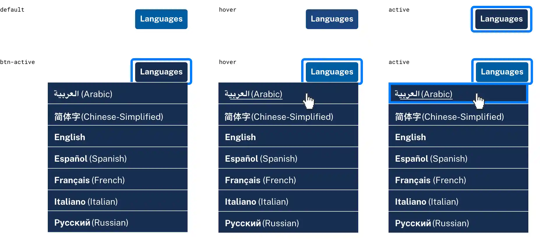
Language selector with three or more languages
Give users the ability to select their preferred language when visiting a website available in three or more languages.
<div class="usa-language-container usa-language--small">
  <ul class="usa-language__primary usa-accordion">
    <li class="usa-language__primary-item">
      <button
        type="button"
        class="usa-button usa-language__link"
        role="button"
        aria-expanded="false"
        aria-controls="language-options"
      >
        Languages
      </button>
      <ul id="language-options" class="usa-language__submenu" hidden="true">
        <li class="usa-language__submenu-item">
          <a href="javascript:void()"
            ><span lang="ar" xml:lang="ar"
              ><strong>العربية</strong> (Arabic)</span
            ></a
          >
        </li>
        <li class="usa-language__submenu-item">
          <a href="javascript:void()"
            ><span lang="zh" xml:lang="zh"
              ><strong>简体字</strong> (Chinese - Simplified)</span
            ></a
          >
        </li>
        <li class="usa-language__submenu-item">
          <a href="javascript:void()"
            ><span lang="en" xml:lang="en"><strong>English</strong></span></a
          >
        </li>
        <li class="usa-language__submenu-item">
          <a href="javascript:void()"
            ><span lang="es" xml:lang="es"
              ><strong>Español</strong> (Spanish)</span
            ></a
          >
        </li>
        <li class="usa-language__submenu-item">
          <a href="javascript:void()"
            ><span lang="fr" xml:lang="fr"
              ><strong>Français</strong> (French)</span
            ></a
          >
        </li>
        <li class="usa-language__submenu-item">
          <a href="javascript:void()"
            ><span lang="it" xml:lang="it"
              ><strong>Italiano</strong> (Italian)</span
            ></a
          >
        </li>
        <li class="usa-language__submenu-item">
          <a href="javascript:void()"
            ><span lang="ru" xml:lang="ru"
              ><strong>Pусский</strong> (Russian)</span
            ></a
          >
        </li>
        <li class="usa-language__submenu-item">
          <a href="javascript:void()"
            >Selected content in additional languages</a
          >
        </li>
      </ul>
    </li>
  </ul>
</div>Guidance
When to use the language selector with three or more languages component
- Content is available in three or more languages. Use this component if your site offers equivalent content in three or more languages.
When to consider something else
- Incomplete content translations. If your site includes content in three or more languages but the majority of content is not available in each language.
Accessibility guidance
- There should be enough color contrast between the button, the text inside the button, and the background to ensure readability.
- The language of each page should be identified using the HTML lang attribute (
<html lang="en">, for example). Please see H57: Using the language attribute on the HTML element. - All logically related items/links must be presented as an HTML unordered list. Please see H48: Using ol, ul and dl for lists or groups of links.
- Language links should contain a span element with the lang attribute. Every language link in the language selector dropdown that is different from content of the current page, should be defined using the lang attribute on a
<span>tag wrapping the relevant text (e.g.,<span lang="es">Hola</span> means Hello.). Please see H58: Using language attributes to identify changes in the human language.
Using the language selector with three or more languages component
- The language button uses the
.usa-buttonclass and can be customized using the many available button variants. - For the in-header example, the language button uses the
usa-button--smallvariant to match the size of the search button. - The language selector dropdown utilizes the accordion component which is also a dependency in the header component and is used by the navigation dropdowns in all example headers.
- Customize the language button as needed for your implementation.
Package
-
Package usage:
@forward "usa-language-selector";
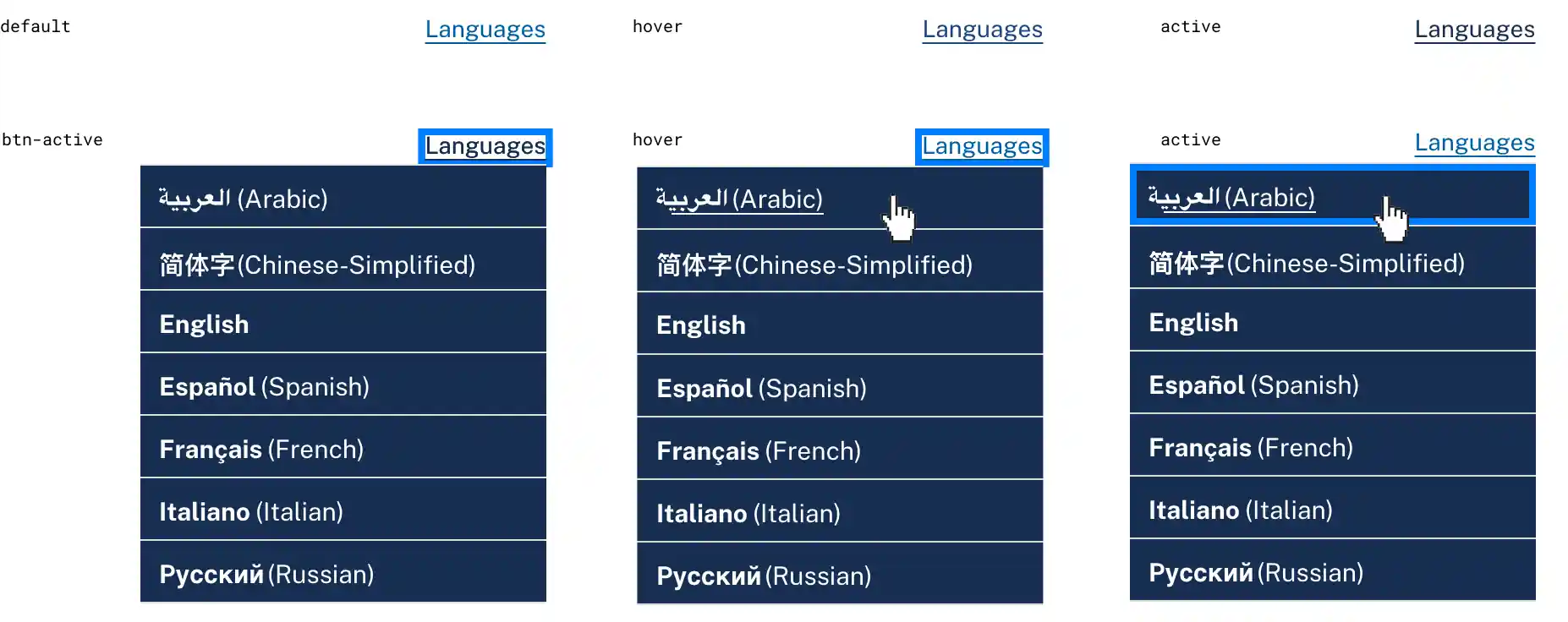
Language selector unstyled
Use the unstyled version of the language button if your implementation calls for a link, or must be placed in a secondary navigation section with other links.
<div class="usa-language-container">
  <ul class="usa-language__primary usa-accordion">
    <li class="usa-language__primary-item">
      <button
        type="button"
        class="usa-button usa-button--unstyled usa-language__link"
        role="button"
        aria-expanded="false"
        aria-controls="language-options"
      >
        Languages
      </button>
      <ul id="language-options" class="usa-language__submenu" hidden="true">
        <li class="usa-language__submenu-item">
          <a href="javascript:void()"
            ><span lang="ar" xml:lang="ar"
              ><strong>العربية</strong> (Arabic)</span
            ></a
          >
        </li>
        <li class="usa-language__submenu-item">
          <a href="javascript:void()"
            ><span lang="zh" xml:lang="zh"
              ><strong>简体字</strong> (Chinese - Simplified)</span
            ></a
          >
        </li>
        <li class="usa-language__submenu-item">
          <a href="javascript:void()"
            ><span lang="en" xml:lang="en"><strong>English</strong></span></a
          >
        </li>
        <li class="usa-language__submenu-item">
          <a href="javascript:void()"
            ><span lang="es" xml:lang="es"
              ><strong>Español</strong> (Spanish)</span
            ></a
          >
        </li>
        <li class="usa-language__submenu-item">
          <a href="javascript:void()"
            ><span lang="fr" xml:lang="fr"
              ><strong>Français</strong> (French)</span
            ></a
          >
        </li>
        <li class="usa-language__submenu-item">
          <a href="javascript:void()"
            ><span lang="it" xml:lang="it"
              ><strong>Italiano</strong> (Italian)</span
            ></a
          >
        </li>
        <li class="usa-language__submenu-item">
          <a href="javascript:void()"
            ><span lang="ru" xml:lang="ru"
              ><strong>Pусский</strong> (Russian)</span
            ></a
          >
        </li>
        <li class="usa-language__submenu-item">
          <a href="javascript:void()"
            >Selected content in additional languages</a
          >
        </li>
      </ul>
    </li>
  </ul>
</div>Guidance
When to use the language selector unstyled component
- Limited space. The unstyled version of the language button is good solution if you have limited space in your area of placement.
- Secondary navigation. You may also use it in a secondary or maintenance navigation section as long as the navigation remains visible on desktop and mobile.
When to consider something else
- Button groupings. Consider using a styled language button if your area of placement contains other buttons.
Accessibility guidance
- There should be enough color contrast between the text of the link and the background to ensure readability.
- Provide a visual element that shows when the text is a link. For example, permanently underline text or when hovering.
- The language of each page should be identified using the HTML lang attribute (
<html lang="en">, for example). Please see H57: Using the language attribute on the HTML element. - All logically related items/links must be presented as an HTML unordered list. Please see H48: Using ol, ul and dl for lists or groups of links.
- Language links should contain a span element with the lang attribute. Every language link in the language selector dropdown, that is different from content of the current page, should be defined using the lang attribute on a
<span>tag wrapping the relevant text (e.g.,<span lang="es">Hola</span> means Hello.). Please see H58: Using language attributes to identify changes in the human language.
Using the language selector unstyled component
- The unstyled language button utilizes the unstyled button class and is easy to implement or customize further.
Package
-
Package usage:
@forward "usa-language-selector";
Latest updates
Meaningful code and guidance updates are listed in the following table:
| Date | USWDS version | Affects | Description |
|---|---|---|---|
| 2023-11-20 | N/A |
|
Removed the note about using links styled as buttons in the two languages variant. More information: uswds-site#2162 |
| 2022-11-14 | 3.3.0 |
|
Component released. More information: uswds#4937 |


